When launching an app on the App Store, your preview images serve as the storefront—the first impression that determines whether users scroll past or stop to learn more. iPad mockups transform simple screenshots into professional presentations that communicate quality and attention to detail before a single word is read.
Why iPad Mockups Elevate Your App Store Presence
The App Store is a visual marketplace where apps compete for attention in milliseconds. A raw screenshot feels unfinished, like showing architectural blueprints instead of the completed building. An iPad mockup frames your interface within a recognizable device, instantly contextualizing how users will experience your app. This subtle shift creates psychological familiarity—viewers mentally place themselves using the app rather than merely observing pixels.
Consider Procreate’s App Store preview. Their images showcase the drawing interface within an iPad mockup, often paired with an Apple Pencil, immediately conveying the tactile creative experience. The device frame doesn’t distract; it enhances by providing spatial context and premium aesthetic appeal.
Strategic Implementation Approaches
Integrating mockups requires thoughtful consideration beyond simply dropping screenshots into templates. Start by identifying your app’s hero moments—the screens that best demonstrate core functionality or emotional impact. A meditation app might feature a serene landscape interface, while a productivity tool highlights its streamlined dashboard.
Effective mockup integration strategies include:
- Layering multiple iPad angles to showcase workflow progression
- Combining device mockups with environmental elements like desktops or creative spaces
- Using perspective angles that create depth and visual interest
- Maintaining consistent color schemes between mockup styles and app branding
Notion’s preview images demonstrate this masterfully. They position iPad mockups at dynamic angles, sometimes showing multiple devices to illustrate collaboration features, creating narrative flow across preview images rather than isolated static shots.
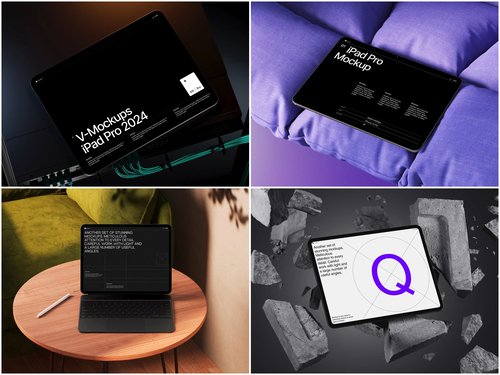
Quality matters enormously in mockup selection. Amateur templates with incorrect proportions or unrealistic lighting undermine credibility rather than building it. Professional-grade resources provide the foundation for preview images that truly convert browsers into downloaders.
The ls.graphics platform stands out for its exceptional iPad mockup collections built specifically for app marketers and designers:
- Ultra-realistic rendering—the lighting, reflections, and material textures are indistinguishable from actual product photography.
- Meticulously organized layers, giving you precise control over shadows, background colors, and device variations without requiring advanced Photoshop expertise.
- Pixel-perfect device dimensions matching actual iPad specifications across all models
- Various angles from straight-on presentations to dynamic three-quarter perspectives
- Multiple color styles including silver, space gray, and rose gold for brand consistency
- Stylish minimalistic compositions that showcase your app without visual competition
And the best part is that ls.graphics mockups are brilliantly easy to use. Just insert your image into a smart layer in a special program (Photoshop or Mockup Plugin) and gibberish!
Real-World Integration Techniques
Let’s examine practical implementation. Suppose you’re marketing a recipe app. Rather than showing the interface floating in white space, place your iPad mockup on a kitchen counter with subtle ingredient props in soft focus background. This environmental context tells a story—your app belongs in real cooking scenarios.
Alternatively, for a business analytics app, position the mockup on a clean desk with minimal office elements. The composition suggests professional utility without clutter. Apps like GoodNotes utilize this approach, presenting their note-taking interface within iPad mockups surrounded by pens or notebooks, bridging digital and analog workflows visually.
Shadow and reflection adjustments prove crucial. A mockup with properly rendered depth appears grounded in space rather than pasted onto backgrounds. Premium templates provide separate shadow layers, allowing you to intensify or soften based on your background choice, maintaining photorealistic coherence.
Conclusion
iPad mockups aren’t decorative flourishes—they’re strategic tools that bridge the gap between your app’s potential and user perception. By investing in premium resources and thoughtful integration, you create preview images that command attention in crowded marketplace feeds while accurately representing the quality users will experience. The difference between amateur and professional App Store presence often comes down to these presentation details that signal care, polish, and worth.